Children get a lot of joy out of shapes. Naming a triangle is a huge accomplishment, and putting a square peg in a square hole provides hours of entertainment. But as adults, having a discussion about shapes might come across as a bit childish and weird. Unless, of course, you talk about the shapes of letters; then you can go on for hours, using big words that make you sound smart—words like descender, blackletter, and x-height.
If you were happy to leave shape conversations behind when you graduated kindergarten, don’t worry; we won’t plumb the depths of type nerdery in this post. I’m just going to layout the basics of choosing type for any project, and then give some specific examples you can try in the Cognito Forms style editor.
Rules of Thumb
In the same way you could never fit that square peg in a round hole as a kid, you will also experience failure if you don’t follow some basic rules of thumb when dealing with type.
Words Are Meant to Be Read
Not all typefaces are equally easy to read. Even well designed typefaces aren’t necessarily meant to be used in all contexts. For example: some fonts, called display fonts, are extremely stylized and not that easy to read, but are fine for short headlines with a large font size. However, if you tried to use a display font for a paragraph of text, you’d infuriate your (squinting) readers. Scripts, AKA cursive typefaces, also fall into this category.
Contrast is King
I love hot dogs. They’re great. But if I was served a plate of nothing but hot dogs, I would be wishing for some slaw or something. If I had nothing but hot dogs three meals a day for a week, I’d come to hate them. Variety is the spice of life, and contrast is the key to interesting type choices.
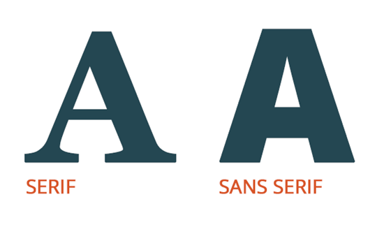
Contrast can come in different forms. Some fonts are really thick and bold; others are super thin. Some have little pointy things hanging off the letters called serifs; some don’t (sans serifs). Headlines tend to be big; paragraph text tends to be small.
The only thing worse than no contrast is so little contrast that the human brain is unable to notice a difference at all. For example, if you use two slightly different serif typefaces, you’ll leave folks feeling like they’re reading one sloppily made typeface. You want the more obtuse non-typophiles among us to be able to easily appreciate the difference.
Strike the Right Tone
Going back to the hot dog example–I’d be craving any kind of food by the end of my scurvy-inducing week of hot dogs, but I wouldn’t be happy if I were served a bowl of ice cream with bits of hot dogs mixed in. In other words, don’t go crazy with the contrast. The tone of your type should be unified and appropriate to the subject matter.
Typefaces have connotations; they inspire feelings in people that can’t be precisely defined. You don’t need to be an expert to know this. Just imagine a letter written in a comic book typeface and think, “If this letter were from a lawyer, would I trust that lawyer?” Or imagine a comic book that used a stately, professional serif face like Times New Roman—BORING! Your type choices should match the tone you want to strike.
Type Combo Ideas for a Cognito Form
With those rules of thumb in mind, let’s come up with some good type combos for a Cognito Form.
1. The Law Firm
Header and Submit Button: Oswald is a no-nonsense, heavy sans serif that demands attention.
Everything Else: Lora is an elegant serif that looks serious, but also has a little character.
2. The Speakeasy
Header, Labels, and Submit Button: Limelight is a display font that suggests the 1920s. It needs to be pretty large for it to be readable.
Everything Else: Open Sans is a well-made typeface that doesn’t call a lot of attention to itself. It is taking second billing to Limelight.
3. The Wedding RSVP
Header: Dancing Script is a nice script face that suggests a certain formality, but also has a fun bounce to it. I’ve centered the heading to add an aura of formality.
Everything Else: Georgia is a solid serif font that compliments the tone of the cursive header, but still provides ample contrast.
4. The Kid’s Birthday Party
Header, Labels, and Submit Button: Architects Daughter is just off-kilter enough to look really fun, but still easily readable at large sizes.
Everything Else: Montserrat is a fairly heavy sans serif face that calls a little more attention to itself than the average sans serif.
5. The Startup
Header and Submit Button: Roboto Slab has slabs for serifs. This makes it look less stuffy than normal serifs.
Everything Else: Ubuntu is a very distinctive sans serif.
Go Crazy
Take this general guide and go crazy (but not too crazy). If you design any forms that have interesting type combos, please post them in the comments!

Tyler T.
Tyler is the creative director for Cognito Forms. He is a gemini who was born in the year of the dog. Figure the rest out on your own!